About       Resume      Instagram      Updates


SHERMAN ASSOCIATES: BRANDING


In the Winter of 2021, Juxtaposition Arts was hired to develop
an identity and visual brand for Sherman Associates’ West
Broadway Curve development. Sherman Associates has residential,
commercial, and hotel properties across the US for rental or lease.
The first stage of this project was to develop a name for the
location (Sherman Associates chose Beam).

The name of the West Broadway Curve development is crucial in
determining the visual direction of the branding package. For this
reason, the identity name was the first stage of this project. It required
critical consideration of how the location will resonate with the
Northside community and define the West Broadway Curve.

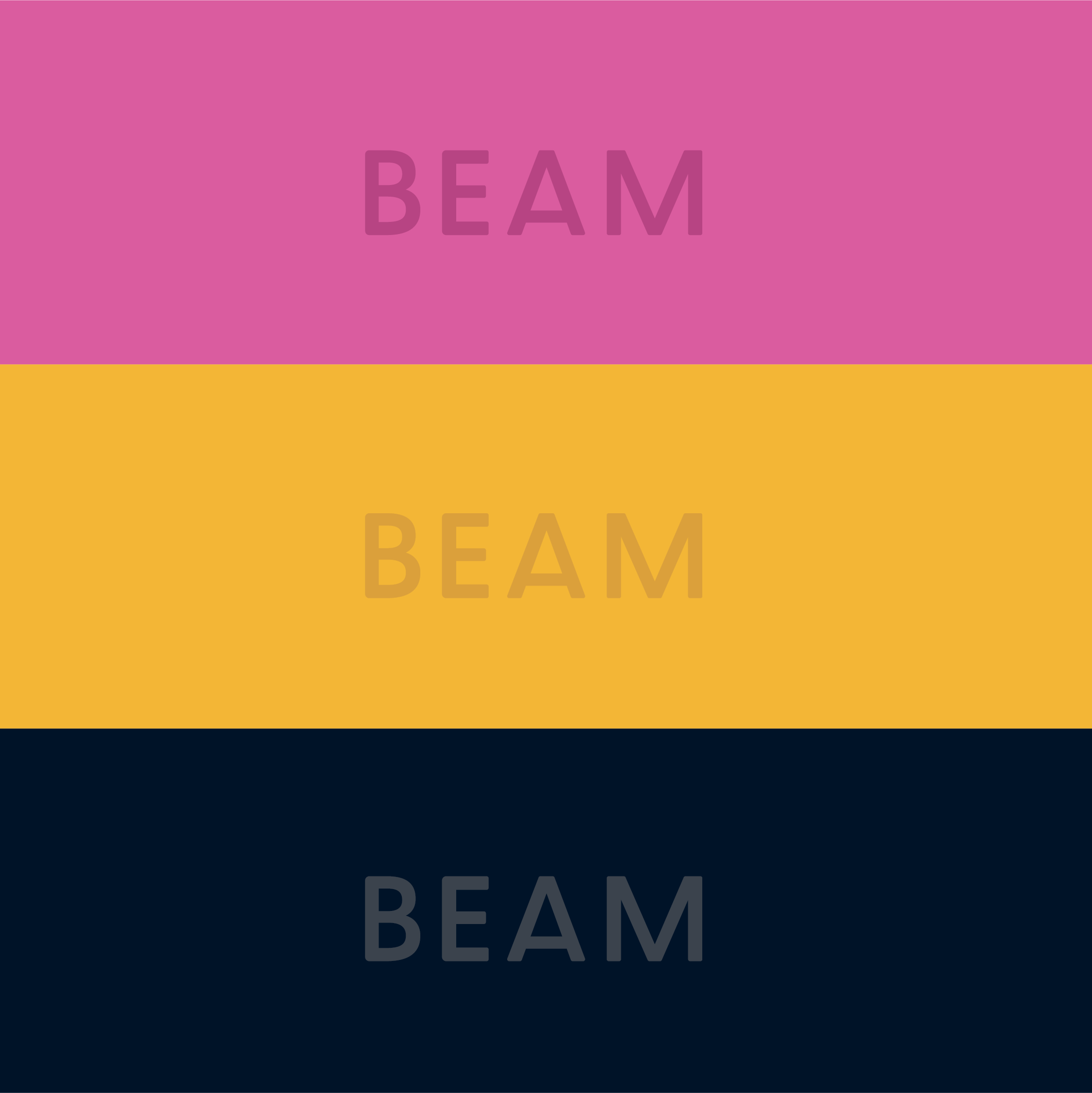
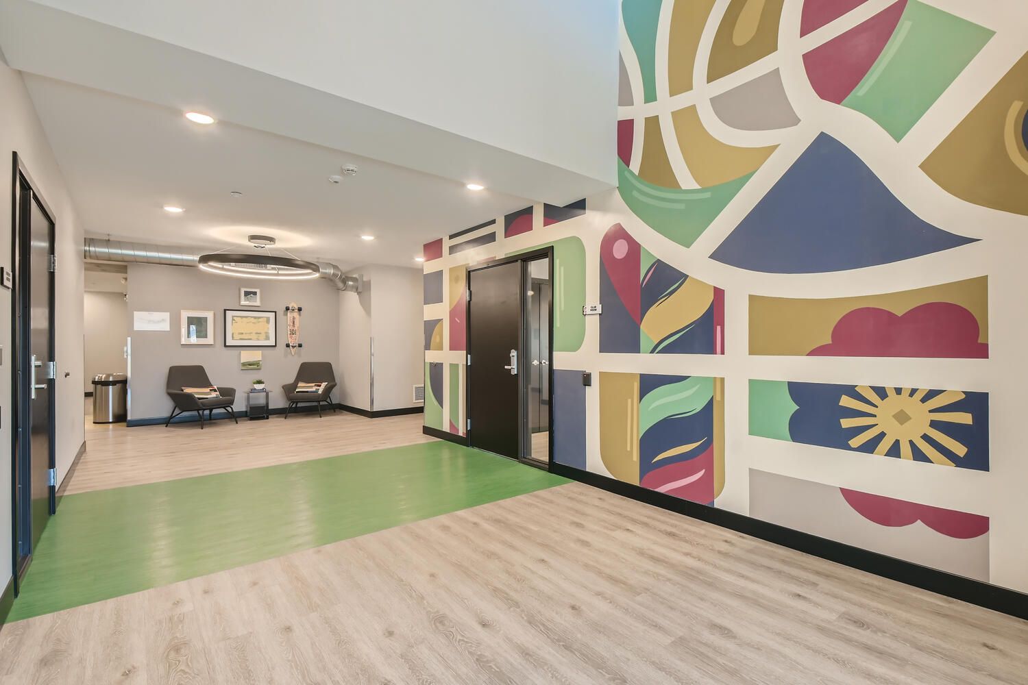
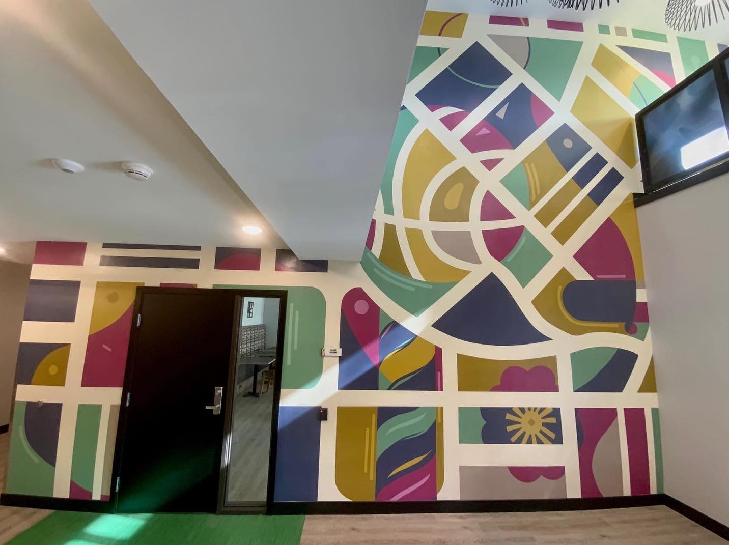
This Fun, Lively and activated color pallet speaks to the creative,
dynamic and individualistic tone of Beam. This pallet capitalizes
off the clients tonal and visual goals all while adding a minimal,
yet modern feel to the branding and identity of Beam.

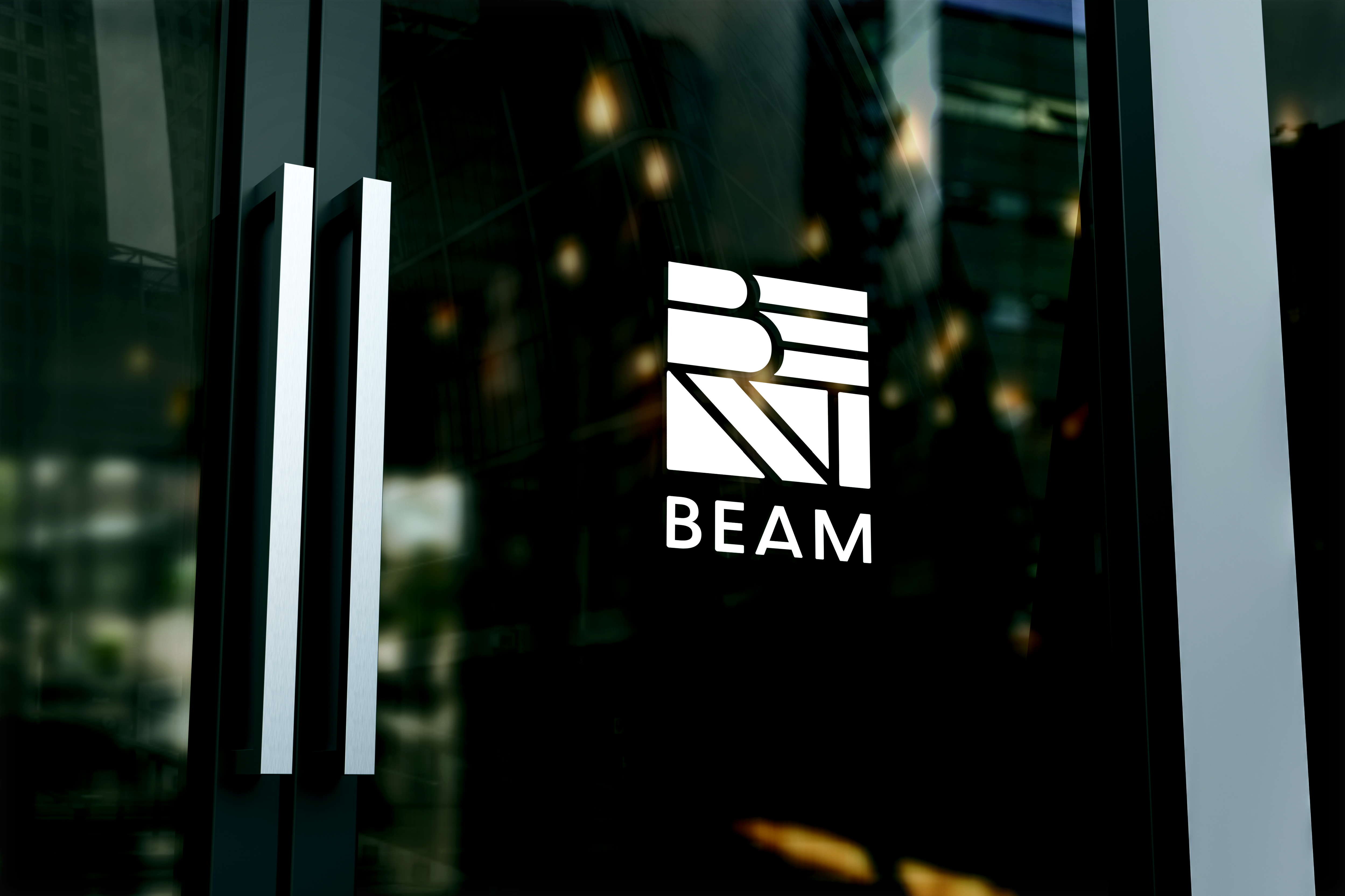
The Beam logo playfully centers itself around the dynamic
compositions that make up Northside. While Northside is known
for it’s vibrant murals and public art, this design is meant to
capture that tone. The abstract use of typography, shape, and
pattern can allow for versatile formatting options. This concept can
be stretched and stacked into any rectangular format.  
 
Juxtaposition Arts Client Project
Creative Direction & Project managment: Taylan De Johnette
Logo Design :  Avahnni L. & Taylan D.  
Brand extension Design: Ethan N. and Taylan De Johnette 


January 2021


©Taylan De Johnette. All Rights Reserved